Cogbias AI Beta
Application re-design
.png)
Overview
Cogbias AI is an application built by a team passionate about cognitive biases. This application allows individuals to input their any questions they might be preparing for an interview and/or a questionnaire, or an email they're addressing to someone, and Cogbias AI will detect any cognitive biases found. Not only will it describe what biases were found and how to improve this, it also provides suggestions to rephrase your wording.
The Problem
The client aimed to redesign their application and allow for mobile access to the application. They wanted to increase content engagement and better conversion rates by elevating their UI and user experience. They also did not have the email feature beforehand, so they needed UX designers to innovate a solution for the email interface vs the questionnaire interface.
My role
-
Demonstrate high-quality design practices. This includes certain aspects of product design: strategy, concept, interaction design, visual execution, and QA.
-
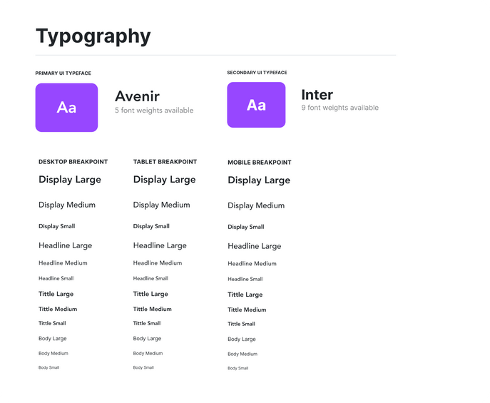
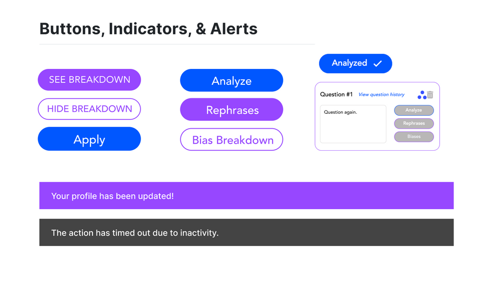
Develop scalable design systems & principles
-
Lead the project through design process: strategy, information architecture, interaction design, launch and testing
-
Developed the application using Flutterflow and JS.
Define Phase
The define phase helps us gather ideas by looking at what we currently have vs. what we need to have. It's when we establish features, functions, and any other elements that will allow us to solve the problem(s).
Ideation Phase
In this phase, we begin the flow of innovation. This is when we continuously iterate until our client is content with the final product.
Objectives
-
To determine key visual components, features, and overall page layout.
-
Develop a mobile view that is responsive and avoids user burnout.
-
Consistently researched the features we were designing with FlutterFlow documentation, since development through FlutterFlow was going to be our next step.
Project Result
As a result, we delivered a new clear and intuitive interface.
Features
-
We implemented a color palette derived from the original logo and incorporated it into the interface to clearly identify which type of project it is by the definition card on the home page.
-
The email feature was designed to feel very familiar to the questionnaire project type but with a layout that effectively tells the user what this feature is for.
-
The navigation bar was updated to resemble standard navigations you would find in other interfaces, following the isomorphic correspondence principle.
-
The profile page was updated to allow the user to see their information at any time and also allow edits, if they wish to do so, following the progressive disclosure principle.
-
Implemented the new design and full functionality for mobile and tablet views.
-
Requested more additional information from the user at initial sign-up to encourage more descriptive stats on our user pool.
-
Implemented better feedback mechanisms to help the user understand an error or lag and how to get out of it.





%201.png)