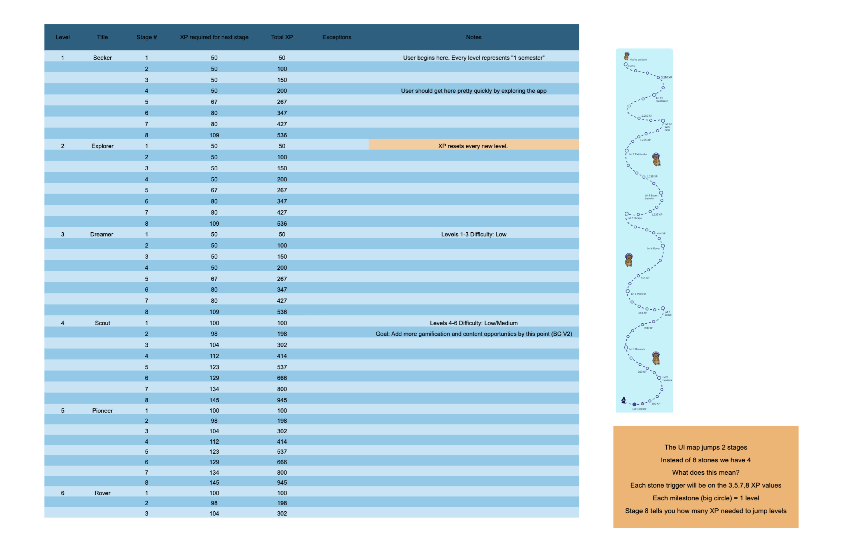
A student support ecosystem.
Base campus is a specialized wellness platform for university students to track moods, access local resources, and find community.
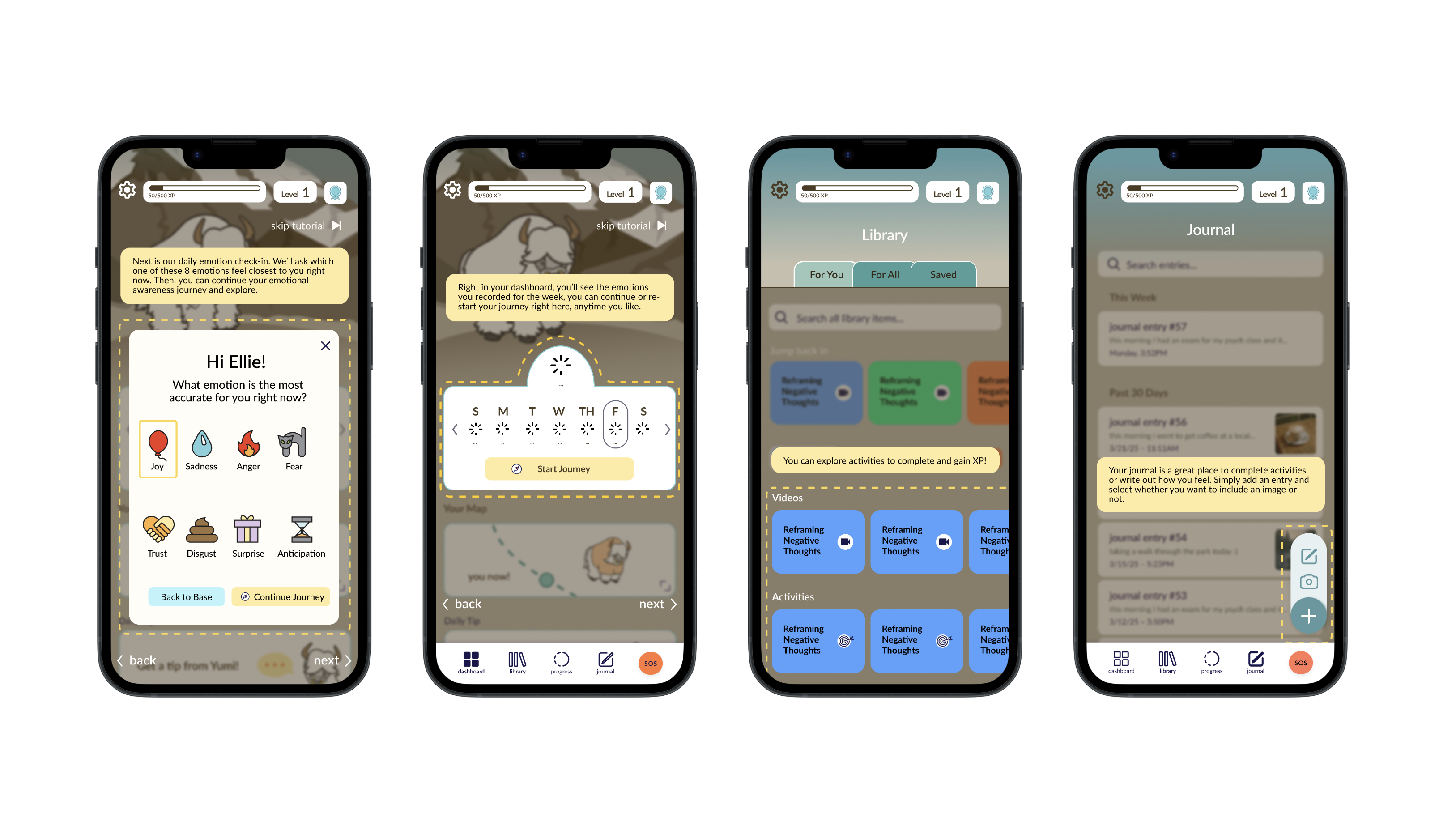
My role was to overhaul the user experience, moving from a developer-centric layout to a human-centric workflow that guided users through the creation process without friction. A crucial request from the client was solidifying a gamification strategy and the theme system.
The main questions we had:
- How might we reduce the cognitive load for stressed students?
- What specific vocabulary triggers anxiety vs. trust?
- How can we introduce gamification without feeling trivial?
Cognitive Overload
The original interface presented a wide range of possibilities with very specific clinical jargon. Users didn't know where to start, leading to high drop-off rates. Our goal was to create a safe, low-barrier entry point for self-care.
- High drop-off rate at setup
- Confusing clinical jargon
- No gamification strategy in place
Research & Insights: Mixed-Methods Approach
The insights gathered from the various approaches informed a series of strategic design pivots, transforming user confusion into a streamlined, high-trust experience for college students.
Usability Testing
Task completion rates and understanding of purpose on "Create your Adventure" feature.
Recorded Walkthroughs
Unmoderated Zoom recordings to capture emotional nuances and initial reactions of every app feature.
Thematic Coding
Synthesis of verbatim quotes into key personas to emphasize key user feedback.
Surveys
Qualtrics analysis and reporting of demographic and visual preferences from 30+ participants.
A/B Testing
Compared "clinical" vs "casual" UI labels and improved the copy to friendlier terms.
SUS Scoring
Measured baseline usability and aesthetic appeal
Target Audience
I identified two primary user archetypes through quantitative user surveys and qual interviews. This ensured every decision served a psychological need.
Primary User
Anxiety DrivenNeeds, Motivations, and Pain Points
- Needs clear, supportive check-ins
- Motivated by passive features (community, journaling prompts)
- Doesn’t always know how/what they feel
- Gets overwhelmed by too many choices or busy visuals
Jess
Curious SeekerNeeds, Motivations, and Pain Points
- Needs mood-linked activities
- Motivated by customizable journaling and calming visuals
- Finds clinical jargon offputting
- Doesn’t want to feel judged by an app
SWOT Analysis
STRENGTHS
(Internal)-
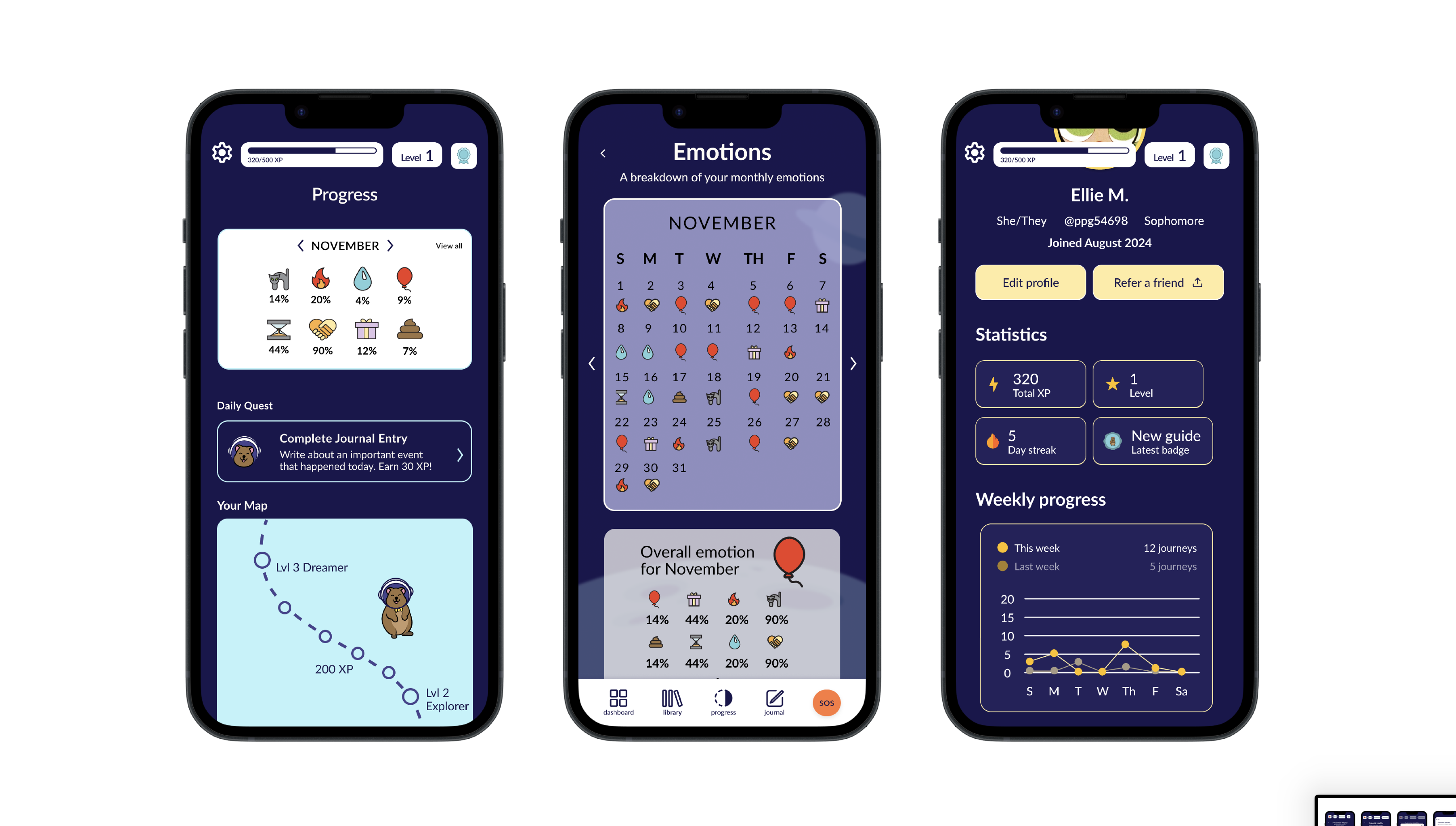
High Feature Engagement: 90% of users found the mood tracker and calendar highly valuable for identifying emotional patterns over time.
-
Warm Aesthetic: Visual design and illustrations were consistently praised for feeling "inviting" and "supportive" rather than clinical.
-
Integrated Resources: 100% positive reception for having all resources in one accessible place.
WEAKNESSES
(Internal)-
Gamification Friction: 60% of users found the "red flag" and inventory system misleading or confusing for a wellness context.
-
Onboarding Speed: 36% of users felt the walkthrough moved too fast, leaving them unsure of the app's core purpose.
-
Survey Fatigue: The "21 Questions" flow was perceived as too long with overwhelming choices.
OPPORTUNITIES
(External)-
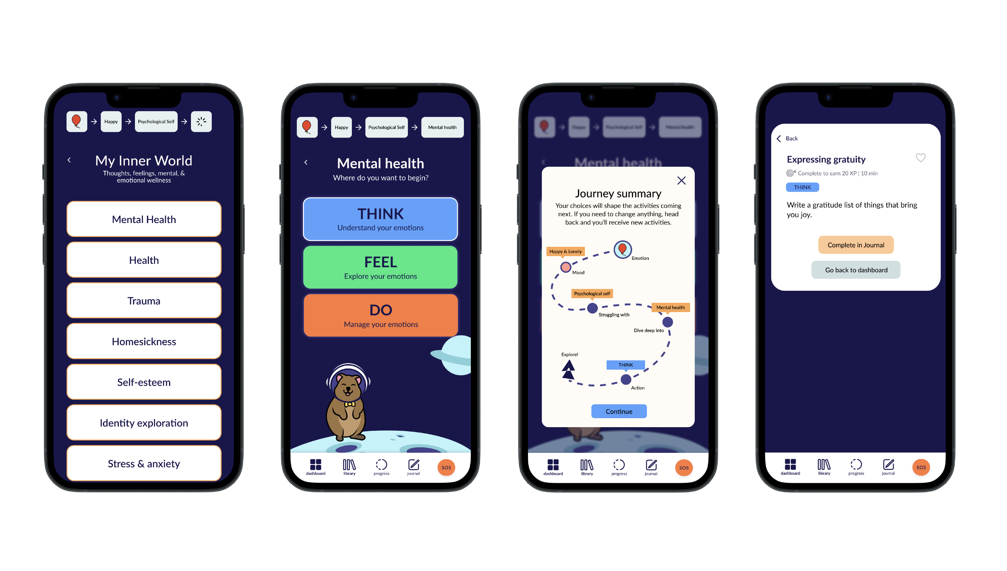
Metaphor Shift: Learning from Finch, there is an opportunity to replace clinical "flags" with growth metaphors (e.g., paths, gardening).
-
Mood-Linked Content: Integrating short yoga or breathing videos immediately after check-ins, similar to Apple Health but with more direct guidance.
-
Passive Community: Opportunity to implement anonymous peer success stories to provide support without the "social pressure" found in typical community feeds.
THREATS
(External)-
Trust & Transparency: Users expressed skepticism about how "meaningful" the personalization actually is.
-
Privacy Sensitivity: Data privacy concerns remain a potential barrier to deep user engagement with journaling features.
-
Market Saturation: Competing with established tools like Daylio requires a clear mission statement that is felt "visually and functionally" from the first screen.
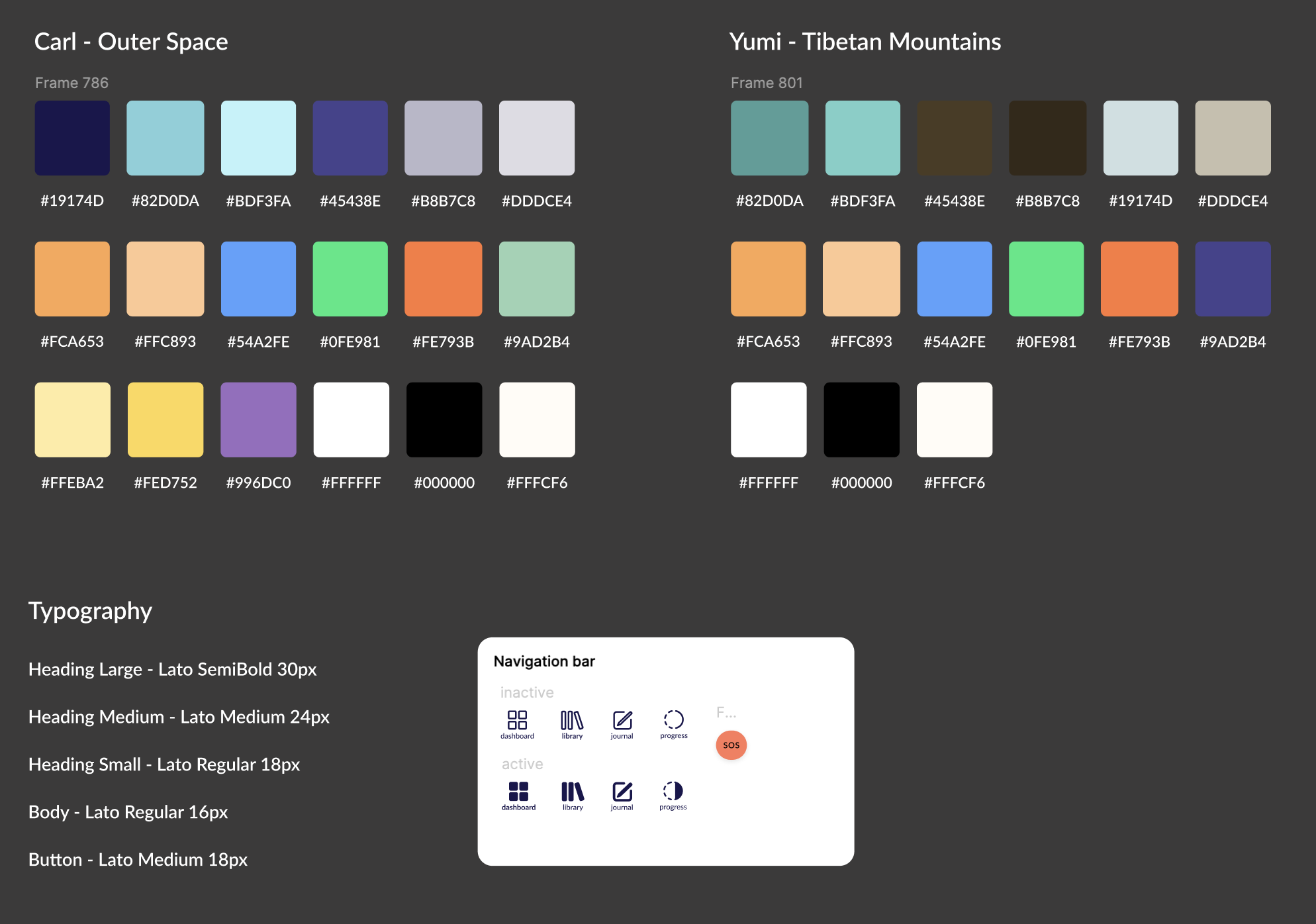
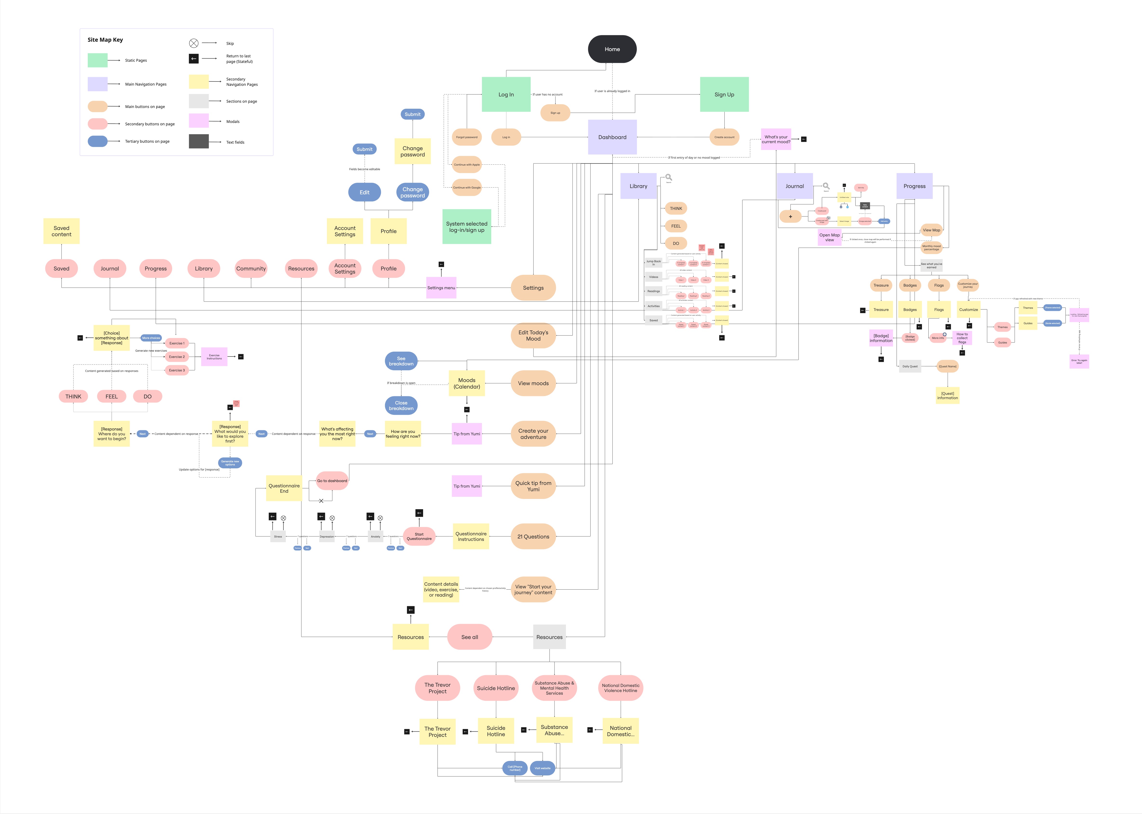
Design System
To ensure consistency across the multiple themes designed for the gamification, I established a design system that is reliable and easy to understand for devs.
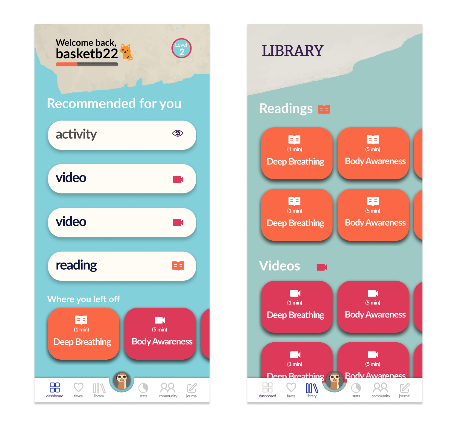
Additionally, I simplified the navigation structure to reduce the number of clicks required to reach the helpful content where students can express their mental status (value moment).
My Approach
Progressive Disclosure
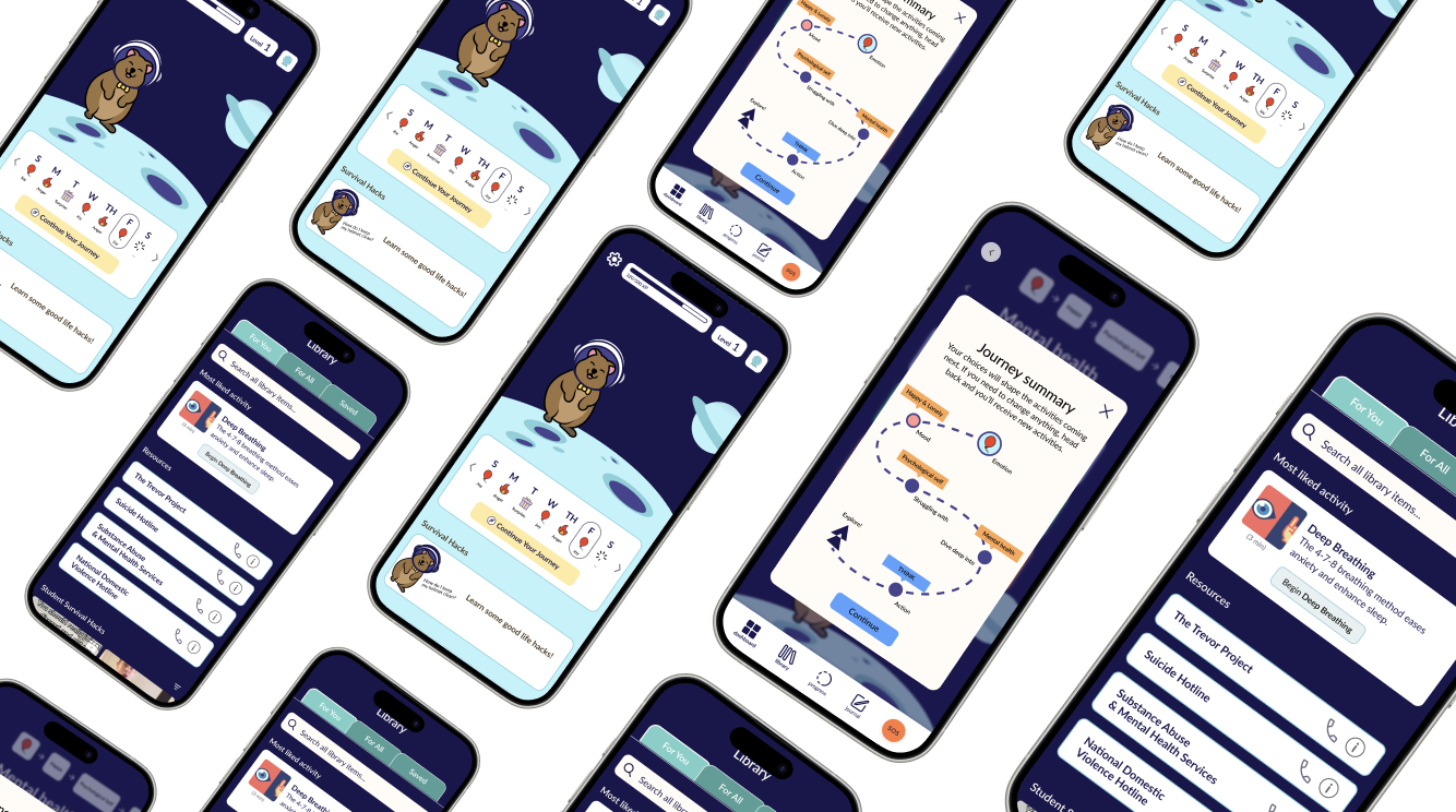
When opening the app, users felt "tossed in" without knowing the apps purpose. To fix this, I implemented a skippable tutorial and a visual purpose summary to build immediate trust.
Supportive Language
Flags and badges came off as judging to our users rather than growth. I replaced clinical jargon with "paths" and "growth" visuals to align with a supportive tone.
Real-time Help
Users wanted actionable help after a bad check-in. I integrated "mood-linked" content directly into the survey results flow.
Gamification Strategy
While 40% of users found the concept of rewards motivating, my research revealed that 60% were confused by clinical metaphors like 'red flags' and 'inventory'. To better align with user needs, I created a solid gamification strategy that focused on care-based rewards rather than traditional game mechanics. By replacing confusing terminology with metaphors of 'paths' and 'growth,' the system now clearly ties rewards to progress, feedback, and actionable advice, ensuring that the mental wellness goal is felt both visually and functionally.
Next Steps
Short term
- Redesign onboarding flow: Add skippable tutorial + visual summary of app’s purpose.
- Clarify gamification: Rework flag and badge system with better metaphors (e.g. paths, growth).
- Tone alignment: Review and rewrite survey labels and flags to feel warm and intuitive.
Medium term
- Connect journaling: Let users reflect on results + revisit emotions over time.
- Mood-linked content: Add short yoga, breathing, or meditation prompts after check-ins.
- Community alternatives: Prototype anonymous feed or curated peer stories (no chat).
Long term
- Build trust through transparency: Show users how their data is used to personalize support.
- Explore trend analytics: Let users view progress across time or "mood streaks".